BRIEF
BRIEF
BRIEF
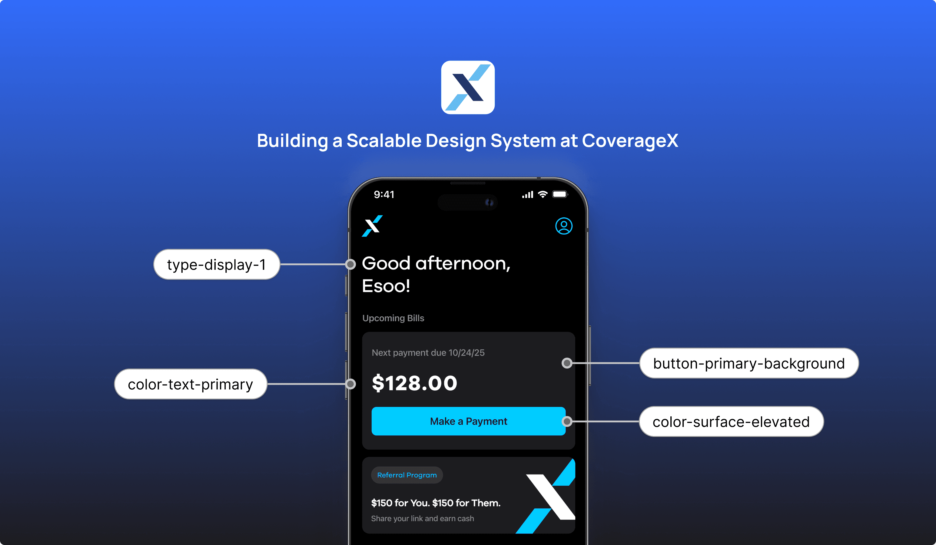
Building a Scalable Design System at CoverageX
Building a Scalable Design System at CoverageX
Building a Scalable Design System at CoverageX
Building a Scalable Design System at CoverageX
Creating consistency, accessibility, and brand alignment across a growing warrenty platform
Creating consistency, accessibility, and brand alignment across a growing warrenty platform
Creating consistency, accessibility, and brand alignment across a growing warrenty platform
Creating consistency, accessibility, and brand alignment across a growing warranty platform
DURATION
DURATION
DURATION
Sep 2025
- Present
Sep 2025
- Present
Sep 2025
- Present
Sep 2025
- Present
ROLE
ROLE
ROLE
UX/UI Designer
UX//UI
Designer
UX/UI
Designer
UX/UI Designer
TEAM
TEAM
TEAM
Project Manager
Product Manager
Visual Designer
Engineering Team
Project Manager
Product Manager
Visual Designer
Engineering Team
Project Manager
Product Manager
Visual Designer
Engineering Team
TOOL
TOOL
TOOL
Figma, Adobe Creative
Suite, Jira, Slack
Figma,
Adobe Creative
Suite, Jira, Slack
Figma,
Adobe Creative
Suite, Jira, Slack
Figma, Adobe Creative
Suite, Jira, Slack
PROBLEM
PROBLEM
Speed enabled the launch,
but not the scale
Speed enabled the
launch, but not the scale
Speed enabled the
launch, but not the scale
As CoverageX introduced an updated brand direction, the team moved quickly to launch the mobile app and bring this new identity to life in the product.
To support this speed, the UI was built directly by iOS engineers, enabling fast shipping and early validation.
As CoverageX introduced an updated brand direction, the team moved quickly to launch the mobile app and bring this new identity to life in the product.
To support this speed, the UI was built directly by iOS engineers, enabling fast shipping and early validation.

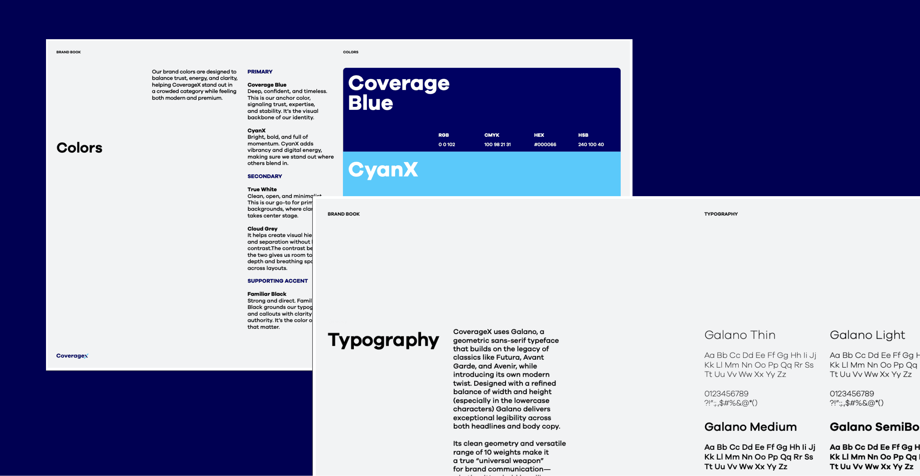
CoverageX New Branding
CoverageX New Branding
CoverageX New Branding
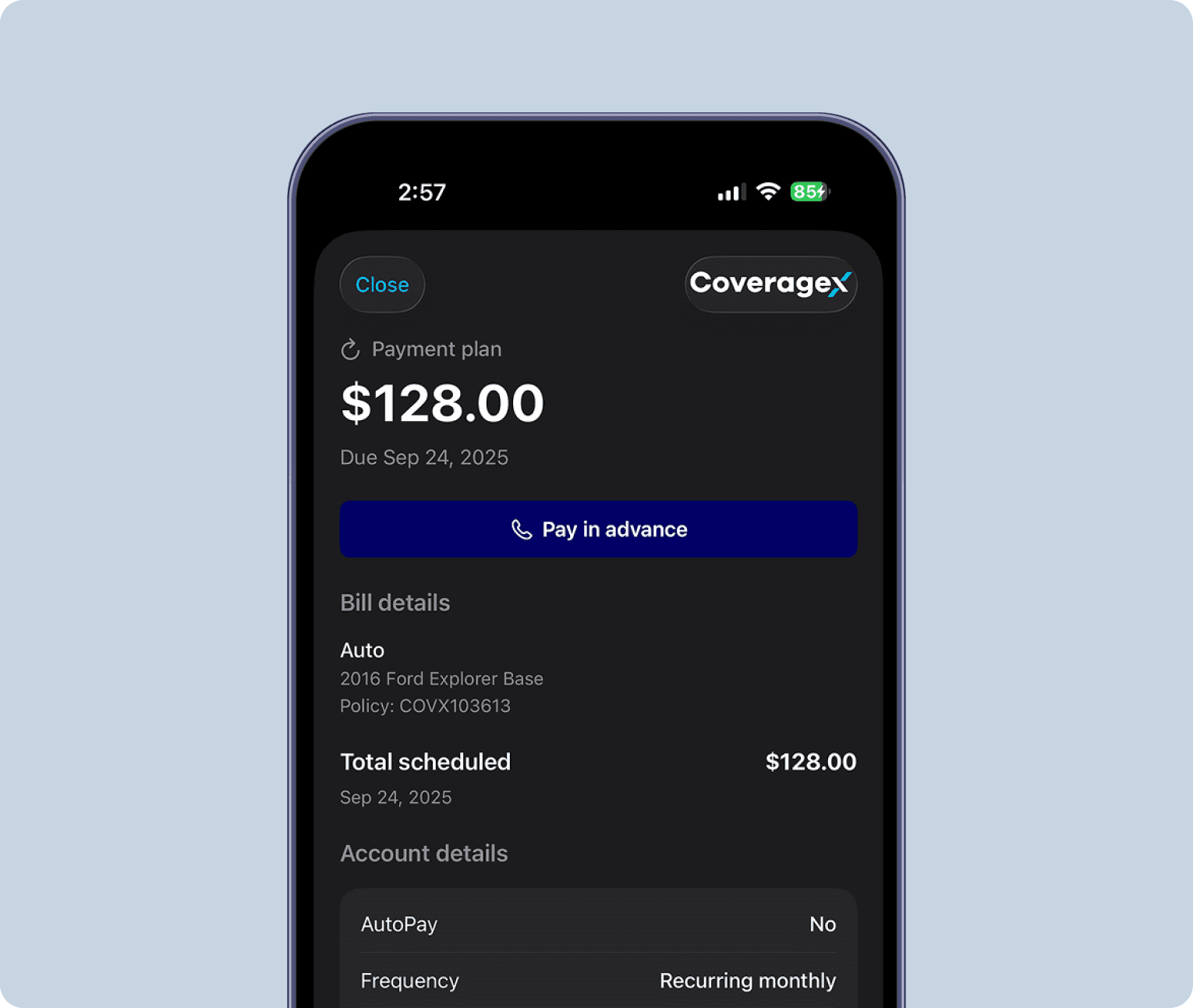
Early Product UI by iOS Engineer
Early Product UI by iOS Engineer
Early Product UI by iOS Engineer
SOLUTION
SOLUTION
Redesign key experiences while transforming the product into a scalable design system.
Redesign key experiences while transforming the product into a scalable design system.
RESEARCH - BRANDING
RESEARCH - BRANDING
Translating brand
into product foundations
Translating brand
into product foundations
Translating brand
into product foundations
Audit existing brand guidelines, marketing assets, and visual identity to understand the intended voice, tone, and personality of CoverageX.
Identify how brand principles such as trust, clarity, and modernity should be expressed in color, typography, layout, and motion within the product.
This ensures the design system reflects the brand, not just UI consistency.
When accessing Stubios on desktop, users encountered a QR code directing them to open the site on mobile.
While this allowed some level of access, it disrupted the experience, created friction, and excluded users who preferred or relied on desktop devices.
RESEARCH - MOBILE APP
RESEARCH - MOBILE APP
Audit the existing
mobile app
Audit the existing
mobile app
Audit the existing
mobile app
Audit the existing mobile app to identify inconsistencies, redundancies, and usability gaps across screens and flows.
Evaluate patterns in hierarchy, spacing, component usage, accessibility, and behavior.
Use this audit to define what should be standardized, what should be improved, and what should be deprecated.
When accessing Stubios on desktop, users encountered a QR code directing them to open the site on mobile.
While this allowed some level of access, it disrupted the experience, created friction, and excluded users who preferred or relied on desktop devices.
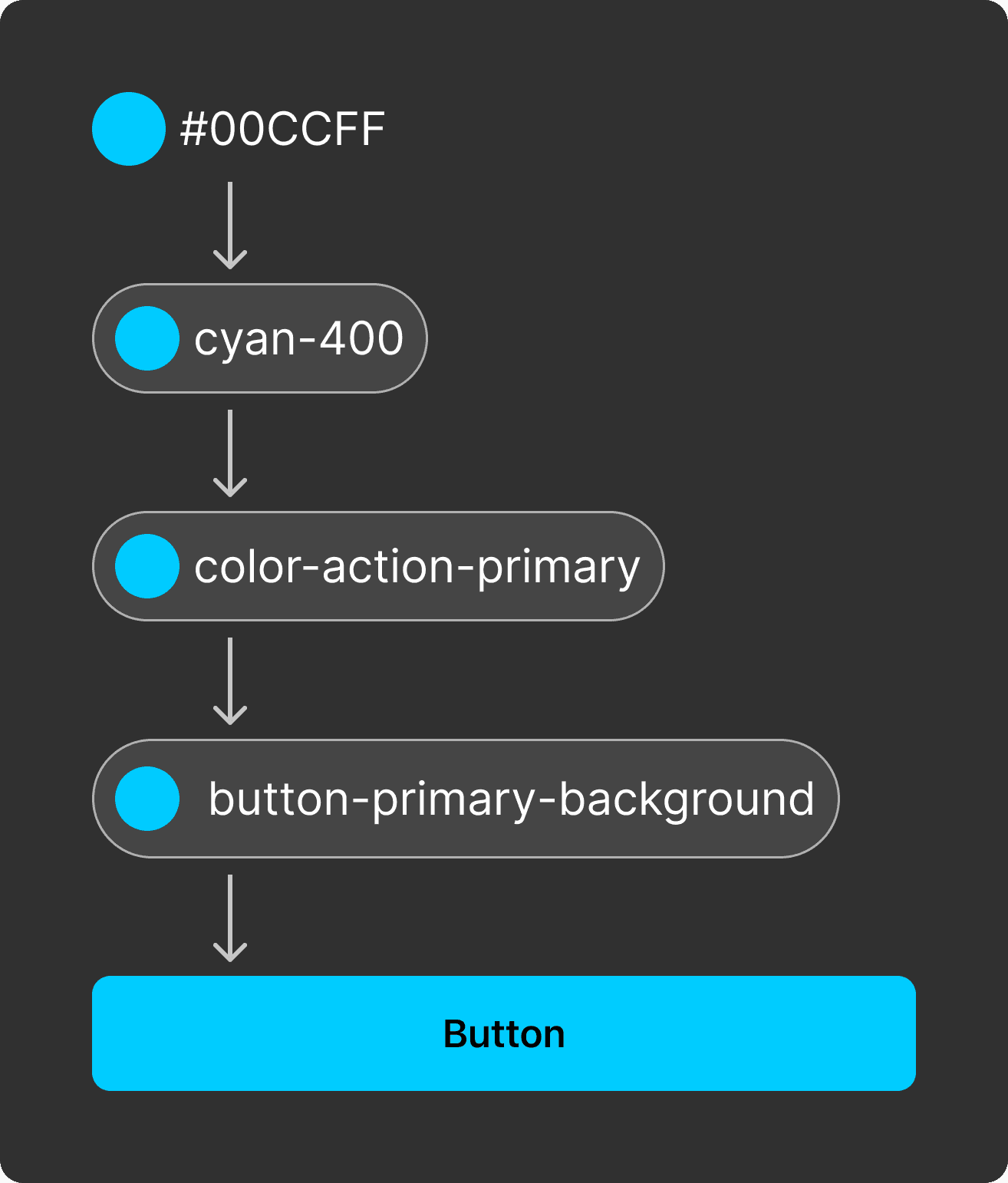
DESIGN SYSTEM
DESIGN SYSTEM
Scalability through
Design Tokens
Scalability through
Design Tokens
Scalability through
Design Tokens
I layered token system that separates raw values, semantic meaning, and component usage to support consistency, scalability, and theming.
I layered token system that separates raw values, semantic meaning, and component usage to support consistency, scalability, and theming.
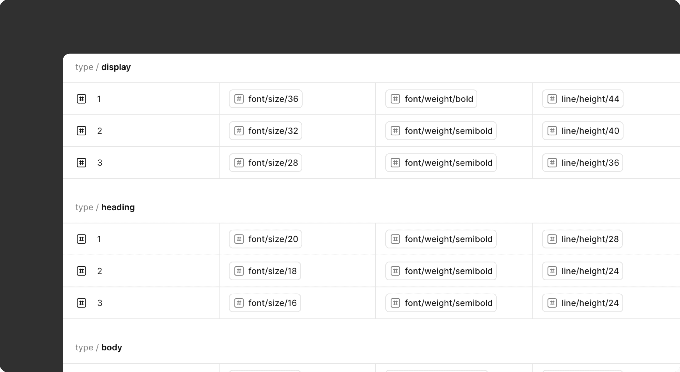
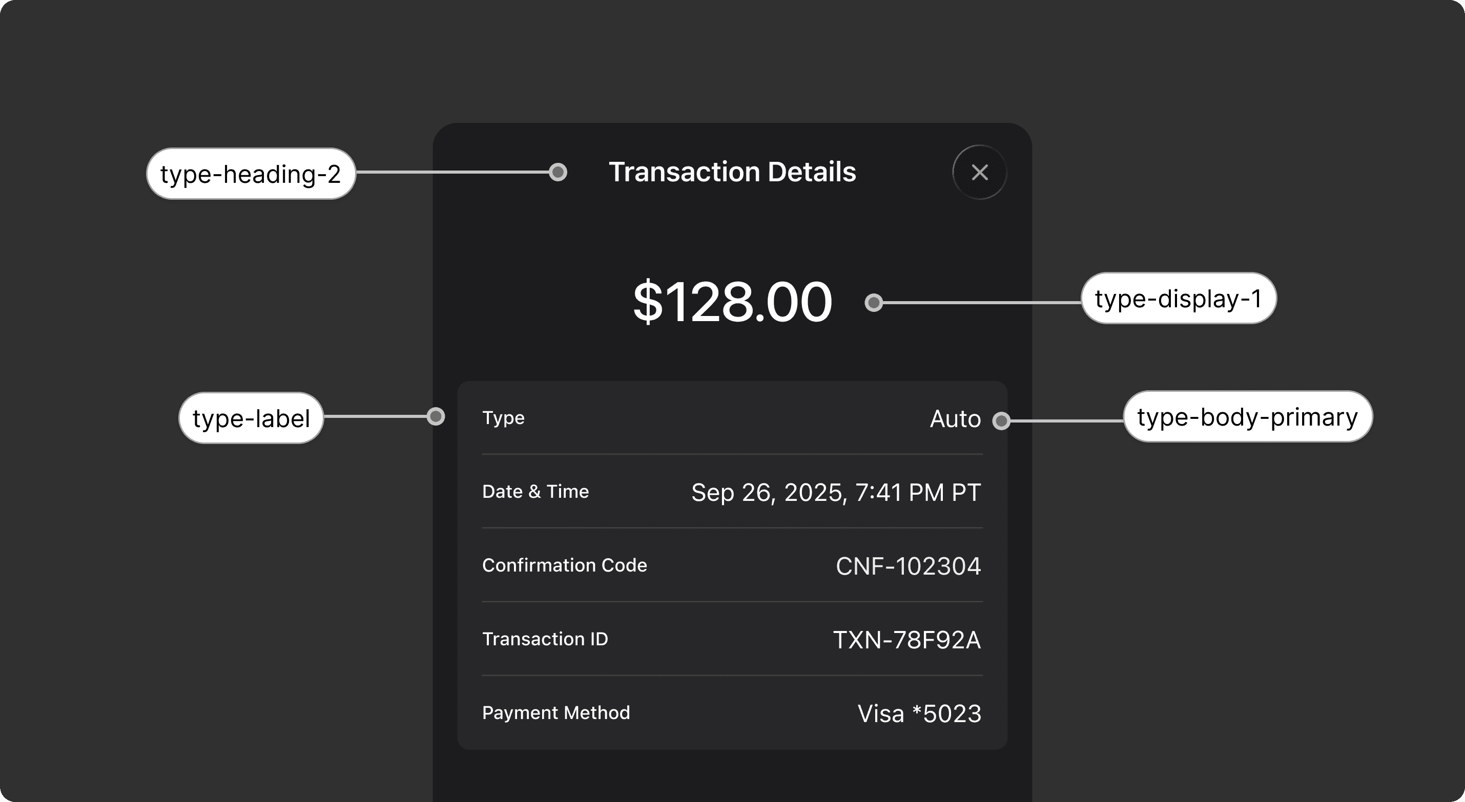
Typography tokens
Typography tokens
As the product UI evolved, typography became harder to keep consistent and maintain. I designed a semantic typography system that defines type by role, improving hierarchy, accessibility, and scalability.
As the product UI evolved, typography became harder to keep consistent and maintain. I designed a semantic typography system that defines type by role, improving hierarchy, accessibility, and scalability.
Layout Grid
Layout Grid
To establish a consistent structure and predictable visual rhythm across the mobile app, a standard layout grid was defined as the foundation of the design system.
Columns: 4
Gutter: 16px
Margin: 16px
To establish a consistent structure and predictable visual rhythm across the mobile app, a standard layout grid was defined as the foundation of the design system.
Columns: 4
Gutter: 16px
Margin: 16px

Columns
Colums
Columns
01 Columns

Gutter
Gutter
Gutter
02 Gutter

Margine
Margin
Margine
03 Margin
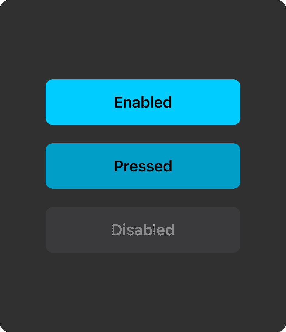
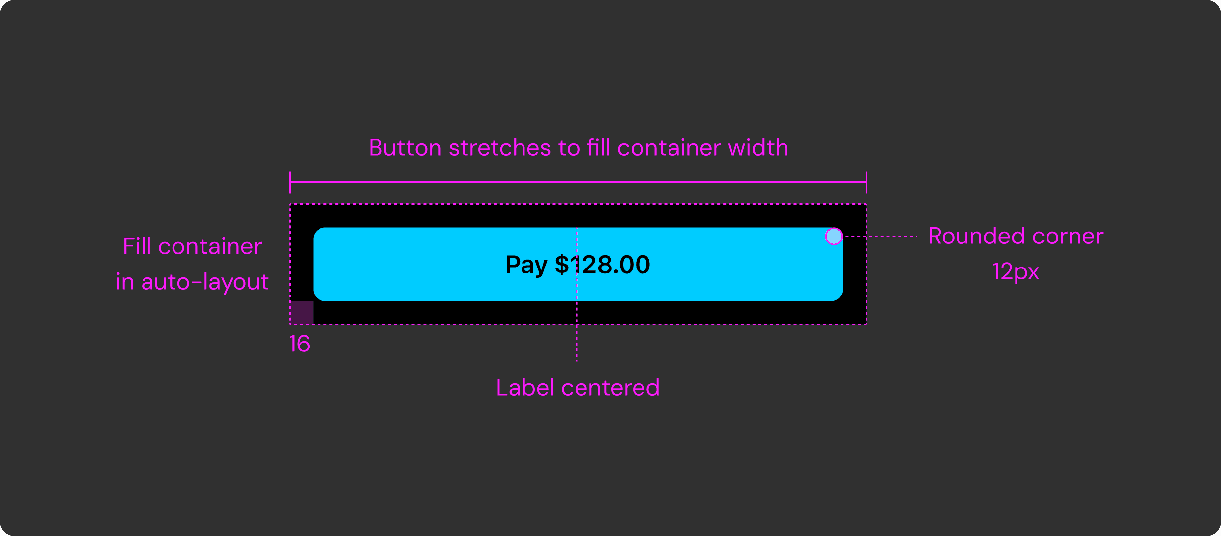
Button
Button
This diagram shows how the contained button fills its parent container and keeps its label centered. Defining button behavior in the design system was essential because buttons are the app’s primary way of taking action.
This diagram shows how the contained button fills its parent container and keeps its label centered. Defining button behavior in the design system was essential because buttons are the app’s primary way of taking action.
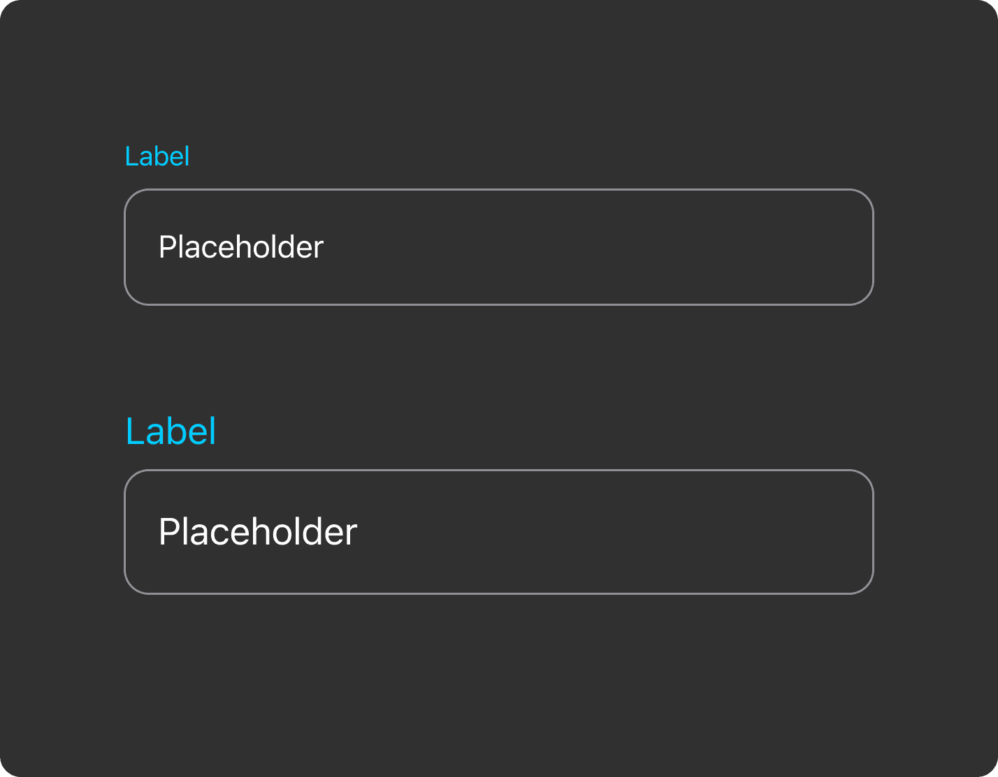
Text Field
Text Field
A token-driven, state-based text area component with clearly defined interaction states — Enabled, Active, Active-Typing, Complete, Error, and Success — ensuring consistent, accessible, and predictable form experiences across CoverageX.
A token-driven, state-based text area component with clearly defined interaction states — Enabled, Active, Active-Typing, Complete, Error, and Success — ensuring consistent, accessible, and predictable form experiences across CoverageX.
A token-driven, state-based text area component with clearly defined interaction states — Enabled, Active, Active-Typing, Complete, Error, and Success — ensuring consistent, accessible, and predictable form experiences across CoverageX.
Enabled → Active → Active-Typing → Complete
Enabled → Active → Active-Typing → Complete
Enabled → Active → Active-Typing → Complete
Success → Error
Success → Error
Success → Error
Other Components
Other Components
Other Components
Reusable input components built as modular patterns.
The examples here showcase three representative controls — Checkbox, Radio, and Bottom Sheet — designed as standardized components that can be reused across the app.
Each element follows consistent states, spacing, and interaction logic so teams can assemble screens faster while maintaining visual and behavioral consistency throughout the product.
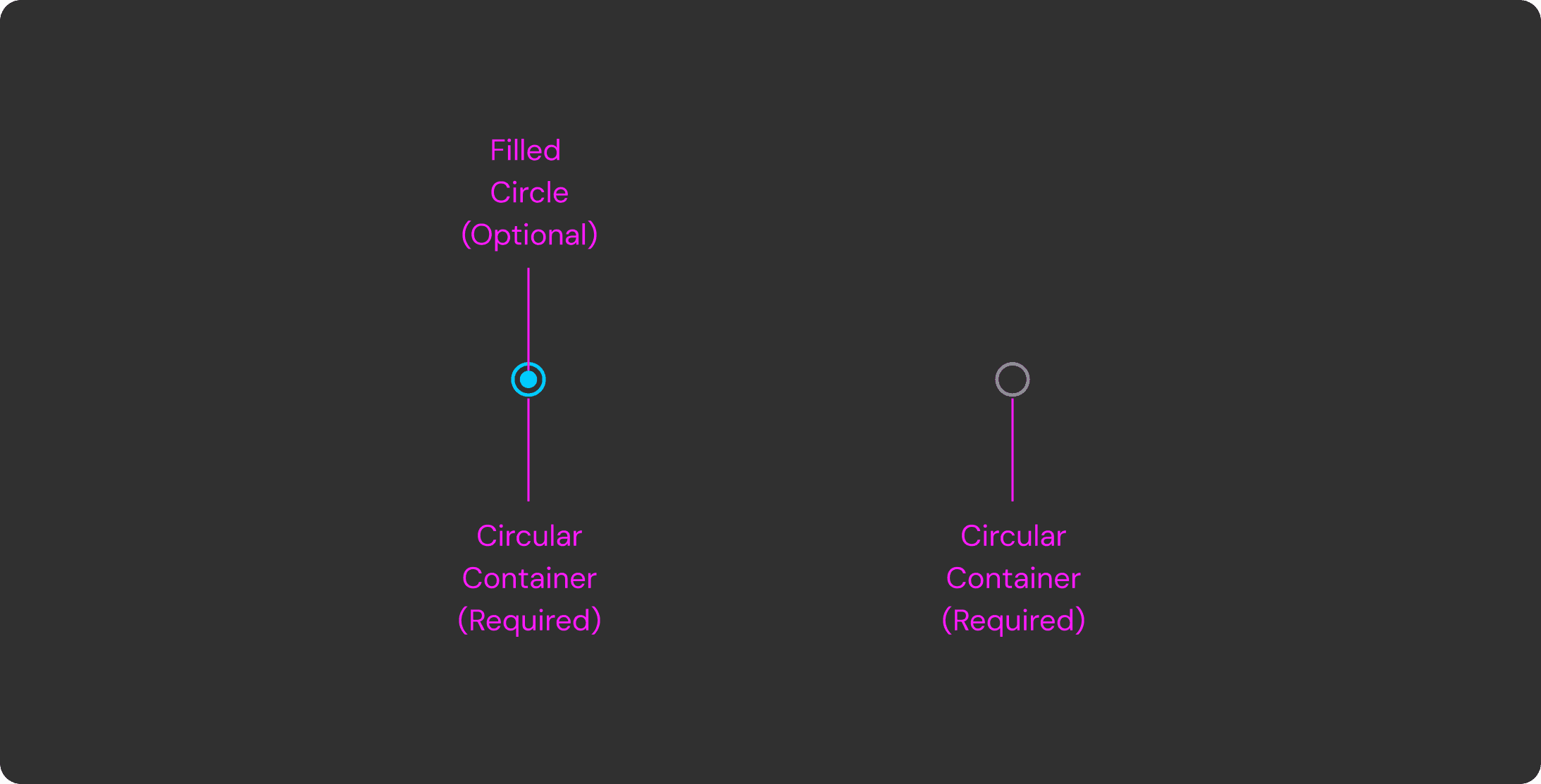
Radio
Radio
Radio
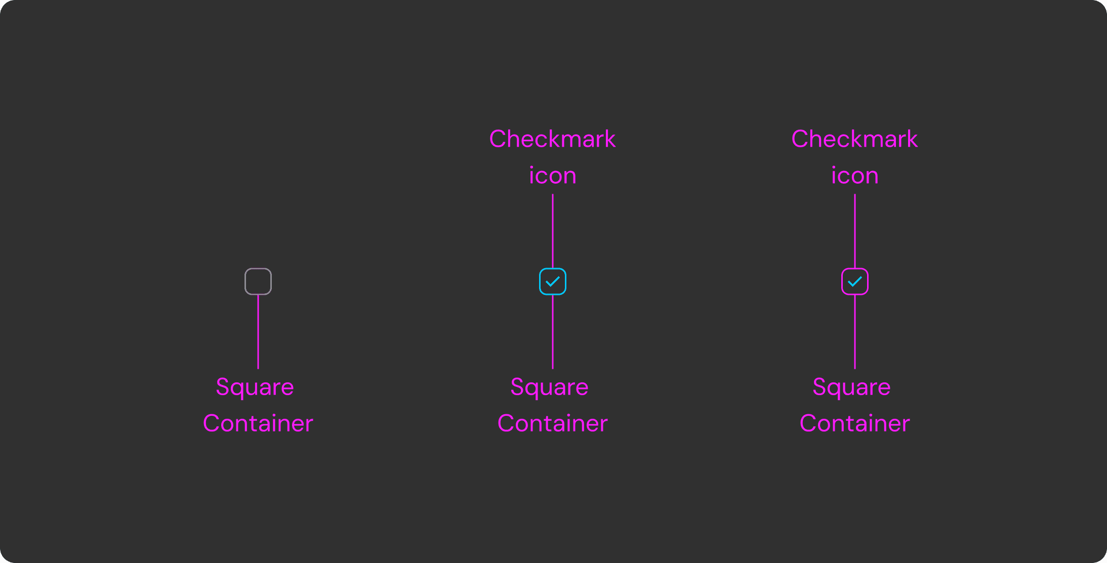
Check
Check
Check
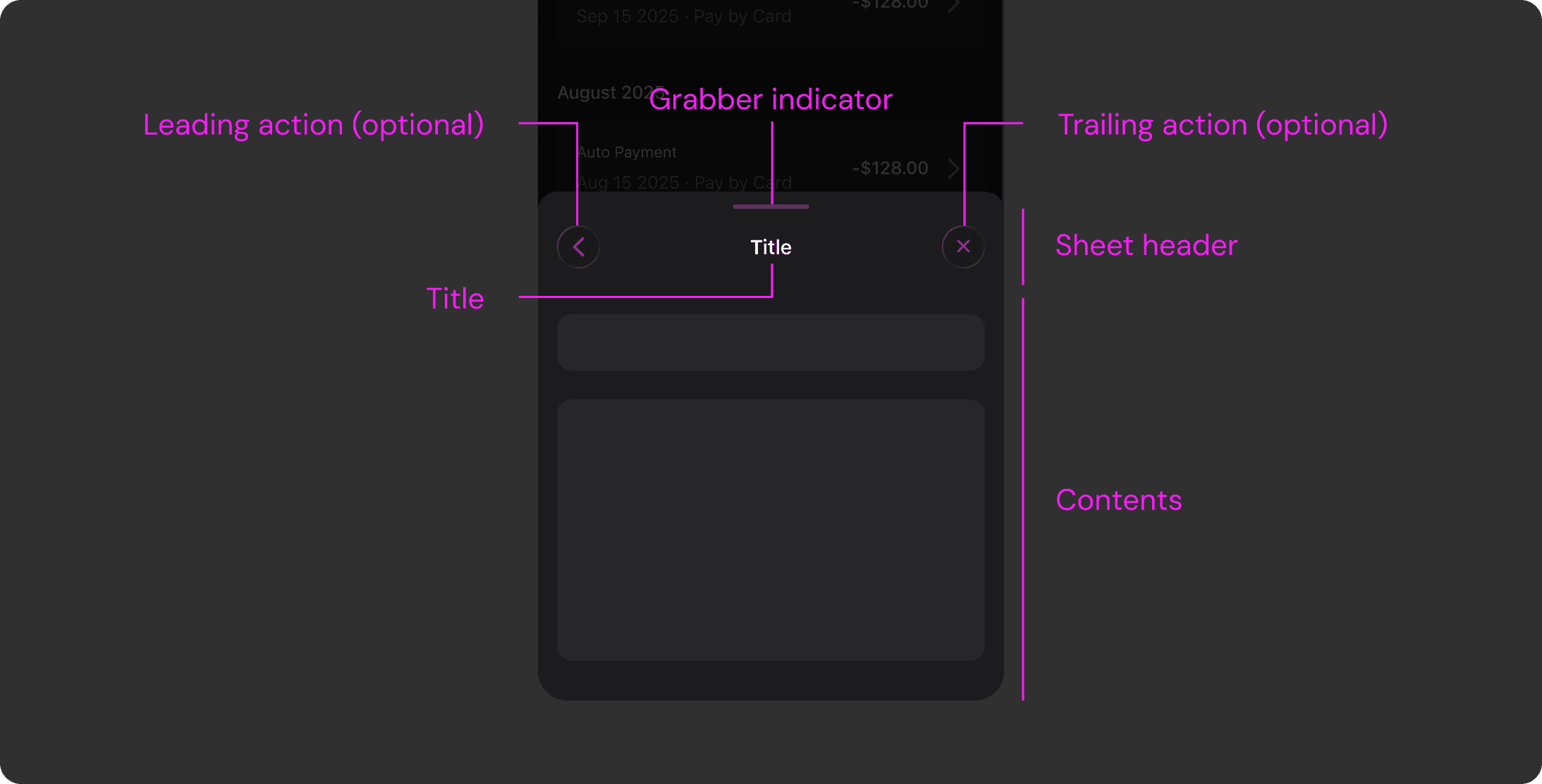
Sheet
Sheet
Sheet
Accessibility
Accessibility
Accessibility
Accessibility
We validated all color combinations through systematic accessibility contrast checks. Considering our users’ age range, we also created a zoom-in accessibility version of key screens with larger typography, increased spacing, and clearer visual hierarchy to improve readability and usability.
We validated all color combinations through systematic accessibility contrast checks. Considering our users’ age range, we also created a zoom-in accessibility version of key screens with larger typography, increased spacing, and clearer visual hierarchy to improve readability and usability.
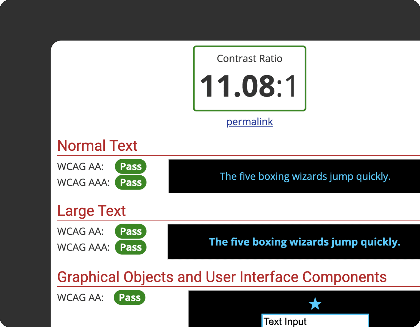
Accessibility contrast checks
Accessibility contrast checks
Accessibility contrast checks
Zoom-in accessibility version
Zoom-in accessibility version
Zoom-in accessibility version
IMPACT
IMPACT
Built to scale
as new features emerge
Built to scale
as new features emerge
As CoverageX ships new features, the design system provides a stable foundation that enables faster and more consistent implementation.
Due to NDA restrictions, full screens cannot be shared, but the examples below illustrate how reusable tokens, components, and patterns support scalable product growth.
When accessing Stubios on desktop, users encountered a QR code directing them to open the site on mobile.
While this allowed some level of access, it disrupted the experience, created friction, and excluded users who preferred or relied on desktop devices.
Friendby
Friendby
Friendby
Claim Process
Claims Process
Claim Process
Claim Process

AI
AI
AI
AI
REFELECTION
REFELECTION
Designing systems with engineers in mind
Designing systems with engineers in mind
Building a design system in a fast paced startup taught me that implementation is just as important as visual consistency. By defining tokens component states and clear usage rules and providing structured documentation I was able to reduce ambiguity during handoff and collaborate more effectively with engineers.
Building a design system in a fast paced startup taught me that implementation is just as important as visual consistency. By defining tokens component states and clear usage rules and providing structured documentation I was able to reduce ambiguity during handoff and collaborate more effectively with engineers.
Designing for scale
not just screens
Designing for scale not just screens
Rather than focusing on individual UI screens I learned to think in terms of patterns and reusable logic. Accounting for edge cases accessibility and responsive behavior early on made the system more resilient and better prepared for future features.
Balancing ideal systems
with real world constraints
Balancing ideal systems with real world constraints
Working under tight timelines and NDA constraints reinforced the importance of prioritization. Instead of aiming for a perfectly complete system I focused on building a strong foundation that supported high impact features first.
Working under tight timelines and NDA constraints reinforced the importance of prioritization. Instead of aiming for a perfectly complete system I focused on building a strong foundation that supported high impact features first.

REFELECTION
What I learned from this project
Designing systems with engineers in mind
Building a design system in a fast paced startup taught me that implementation is just as important as visual consistency. By defining tokens component states and clear usage rules and providing structured documentation I was able to reduce ambiguity during handoff and collaborate more effectively with engineers.
Designing for scale not just screens
Rather than focusing on individual UI screens I learned to think in terms of patterns and reusable logic. Accounting for edge cases accessibility and responsive behavior early on made the system more resilient and better prepared for future features.
Balancing ideal systems with real world constraints
Working under tight timelines and NDA constraints reinforced the importance of prioritization. Instead of aiming for a perfectly complete system I focused on building a strong foundation that supported high impact features first.